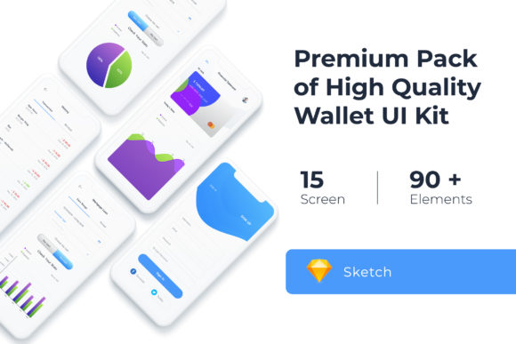
Build Your App Faster with Mobile UI KIT Templates
Starting a mobile application project from scratch can feel like standing at the bottom of a mountain. You have the idea, the user flow, and the brand guidelines, but the blank canvas in your design software is intimidating. For designers, entrepreneurs, and content creators, time is a resource you cannot afford to waste. This is where the Mobile UI KIT steps in, not as a magic wand, but as a foundational architecture that removes the guesswork from the initial stages of app design. Specifically, the Mobile UI KIT – Wallet App collection provides a robust framework for financial applications, but its versatility extends much further.
Visual Style and Aesthetic Appeal
The first thing you notice about this UI Kit is its commitment to modern typography and clean geometry. It doesn't rely on flashy gradients or dated design trends. Instead, it focuses on clarity, which is essential for any functional interface. The visual personality is professional and trustworthy—two traits that are non-negotiable when designing for finance, e-commerce, or productivity apps.
The kit includes 20 pixel-perfect screen designs. "Pixel-perfect" is a term often thrown around in the design world, but here it means the spacing, alignment, and grid systems are mathematically consistent. For a graphic designer or a brand strategist, this consistency is vital. It ensures that when you apply your client's brand identity—their specific color palette, logo, and brand voice—the underlying structure holds up. The aesthetic is minimalist, allowing your content to breathe. It uses negative space effectively, which helps in guiding the user's eye to the most important call-to-action buttons without overwhelming them.
Real-World Applications Beyond Finance
While the name suggests a focus on a Wallet App, the utility of this Mobile UI KIT goes far beyond banking. If you are a small business owner looking to launch a loyalty program, the transaction history screens can easily be repurposed for tracking rewards points. For marketers and publishers, the list layouts are perfect for news feeds, article archives, or podcast libraries.
The kit includes 80++ UI elements. This is where the practical value lies. You aren't just getting 20 static images; you are getting a library of buttons, input fields, toggles, sliders, and navigation bars. This modularity allows you to mix and match components to create entirely new screens. For example, a blogger might use the profile screen design to create a "Meet the Team" page for their app, utilizing the same typography hierarchy found in the financial templates to maintain a sense of authority and trust.
Technical Flexibility for Designers
One of the biggest hurdles in collaborative design is software compatibility. This Mobile UI KIT is built with flexibility in mind, offering files for Adobe Photoshop, Adobe XD, and Sketch. This ensures that whether you are a freelance designer who lives in Sketch or an agency that relies on the Adobe ecosystem, you can integrate these assets immediately.
Because the files utilize 100% Vector Layers and Symbol Objects, the kit is fully scalable. This is crucial for responsive design. You can resize elements for different device resolutions without losing sharpness. The use of symbols means that if you change a color style or a button shape in one place, it updates globally. This feature alone can save hours of work during the revision process. It turns the design process into a system rather than a series of isolated artworks.
Customization and Brand Consistency
A template is only as good as its ability to be customized. The Mobile UI KIT is 100% scalable and fully layered, meaning every shadow, text block, and icon is separated and editable. You can easily change the color style to match a client's corporate identity. If a small business owner has a specific shade of blue for their brand, you can apply it across the entire application in minutes using the global color settings.
The kit comes with free icon vectors and uses free fonts. This removes the headache of licensing costs for essential typography. The included typefaces are typically clean sans-serif fonts, which are the standard for mobile readability. However, the neutral nature of the design allows you to swap these for a premium font or a display font if the project calls for a more distinct personality, such as a luxury retail app or a creative portfolio.
Practical Guidance for Implementation
When integrating this kit into your workflow, start by mapping out your user journey. Don't just use the screens as they are; deconstruct them. Look at the visual hierarchy. Notice how the headers are sized relative to the body text. This is a lesson in modern typography and readability. On mobile screens, contrast is king. The kit handles this well, ensuring that interactive elements stand out from the background noise.
For those working on packaging design or social media graphics that need to link back to an app, you can extract specific UI elements from the kit to use in your promotional materials. Showing a snippet of the app interface in an Instagram post or a brochure adds a layer of professionalism and legitimacy to your marketing efforts.
Remember that while the images included in the preview are for demonstration only, the structural assets are yours to build upon. Treat the kit as a wireframe on steroids. It provides the skeleton; you provide the soul. By leveraging the 80+ UI elements, you ensure that your mobile application looks polished and functions intuitively, regardless of whether it's a complex financial tool or a simple content delivery platform.